Announcement
This page is also available in Português, Deutsch, Español, Italiano, Français, and 日本語.
New in Reports: Easily Understand Cost Flow With Sankey Charts
Sankey charts now available in Reports to visualize how cloud spend flows across services, projects, labels, and other dimensions.
By Karl Kalash
Sankey charts are a type of flow diagram in which the width of the arrows is proportional to the flow quantity. In FinOps context, they visually represent how cloud spend moves from a source (like cloud accounts or projects) to a destination (such as services or labels). They are particularly effective at showing cost transfers and transformations.
Starting today, you can now use Sankey charts in Cloud Intelligence™ to visualize how your cloud spend flows across services, projects, labels, and other dimensions. This new visualization helps you understand cost distribution, identify unexpected patterns, and surface high-impact cost drivers in complex environments.
What you can do with Sankey charts:
- Trace spend across multiple dimensions: See how costs move from source to destination - such as from cloud accounts to services, or projects to labels.
- Identify inefficiencies: Quickly detect cost concentrations or flows that don’t align with expectations.
- Customize the view to your business: Choose any combination of source and target dimensions to reflect your internal org or architecture.
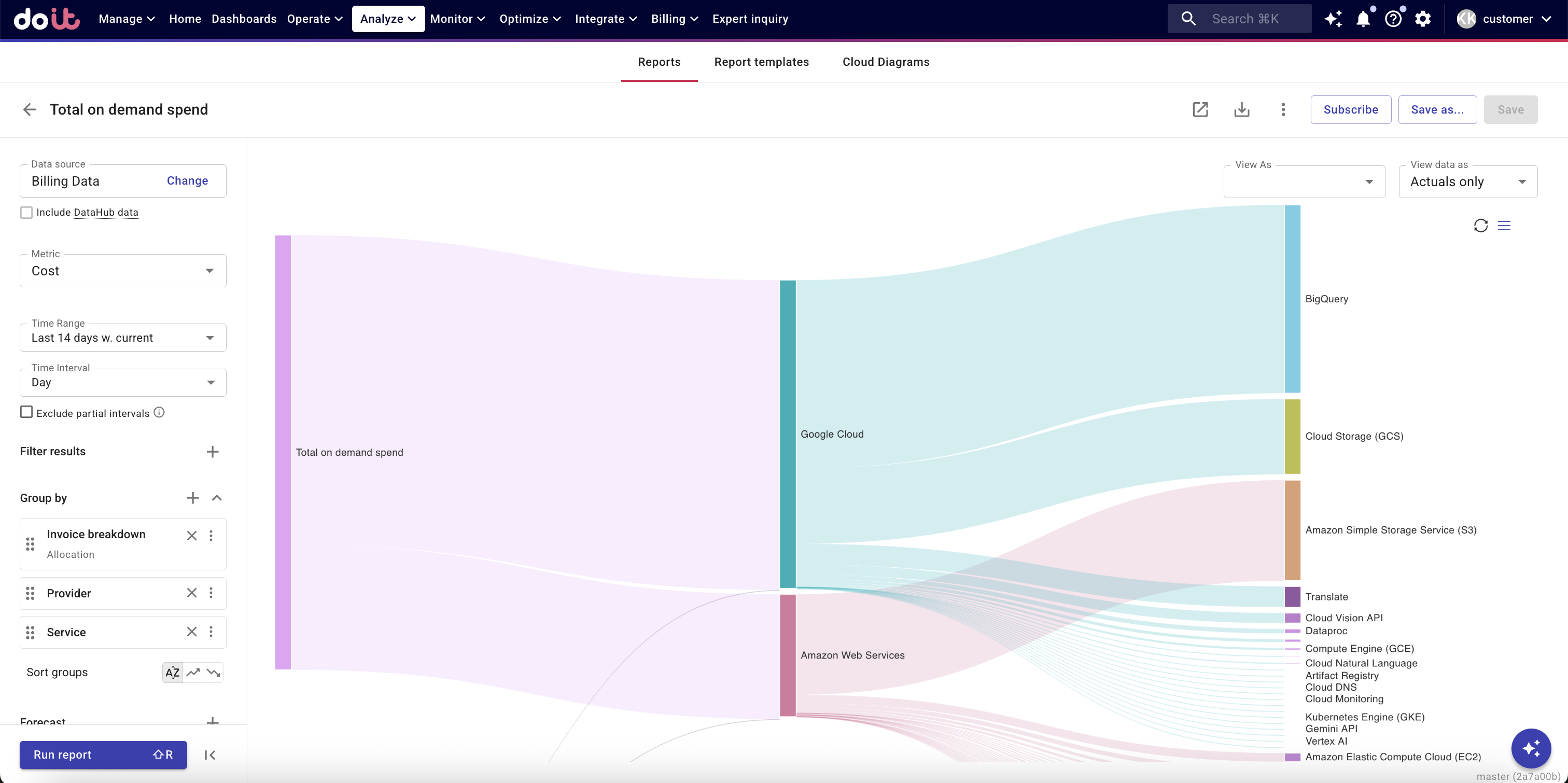
No configuration changes are needed. Just select your Report dimensions and explore the flow as a Sankey chart.