
I’m Jack Green, a UX designer at DoiT, and I’m here to talk about some design changes and decisions in a rework of one of our existing features called ‘Ramp plans’.
Ramp plans visualizes a customer’s progress against their spend commitment to either AWS or Google Cloud, and helps track spending and identify any adjustments needed.
In order to maximize the potential of the feature, the product team decided to introduce some improvements. I conducted a design audit of the existing feature, to identify issues with usability, as well as in the visual design.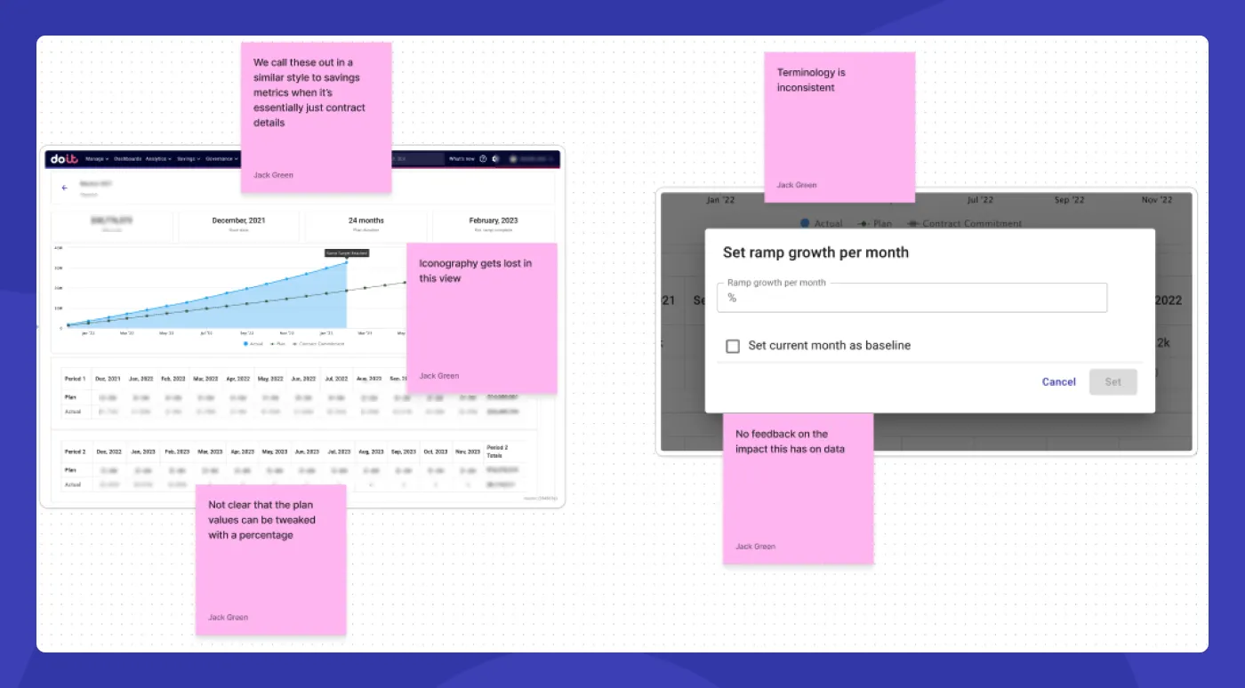
Screenshot from Figjam during the research phase
Using the notes feature in Figjam (shown above), I annotated areas that needed to be discussed and identified areas as key for improvement. From there, I used this as a basis to discuss with the product manager and lead developer, considering their input and feedback based on their experience and customer feedback.
During that session, we identified the key areas we wanted to focus on:
- Improve the visibility of key information
- Update the backend so data is more reliable
We know from user research and stakeholders who interact with customers, what key information is most relevant for the user. So, with this in mind, we wanted to present this in a clear and digestible way.
Updating the backend is not a UX task, but it does have a major impact on the user experience of the ramp plan feature. If the data is more reliable, it builds trust and immediately demonstrates the value of the feature.
The first area of improvement I want to highlight is the list on the ramp plans page. Previously this was a table layout.
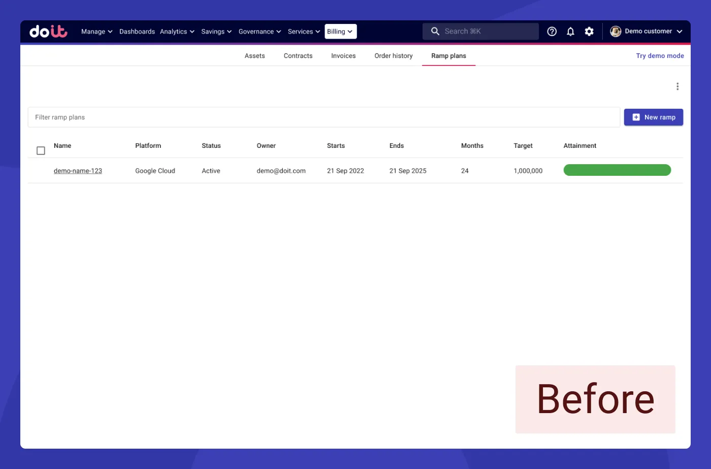
A table isn’t suitable for this context because:
- The amount of content on this page is limited to 1 or 2 ramp plans; the list doesn’t grow
- There’s no hierarchy to the content, making it difficult to pick out details
- Some key information is missing from the table
- You need to click into the ramp plan to fully understand what’s going on
So, I moved away from a table layout to cards:
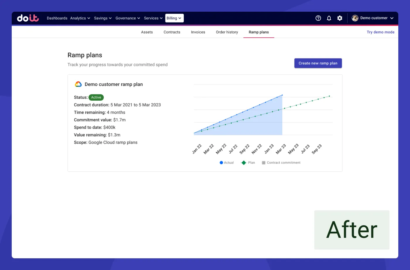
How ramp plans looked after design changes
Using a card layout brought the following benefits:
- Key information is more readable
- Users don’t need to click into the ramp plan for all the key information
- A more visually appealing and balanced hierarchy
We carried this improved style of presenting key information into the ramp plan detailed view.
We introduced cards featuring key details at the top of the page to categorize, organize, and highlight relevant information for the user, that previously wasn’t there or was difficult to unpack from all the data.
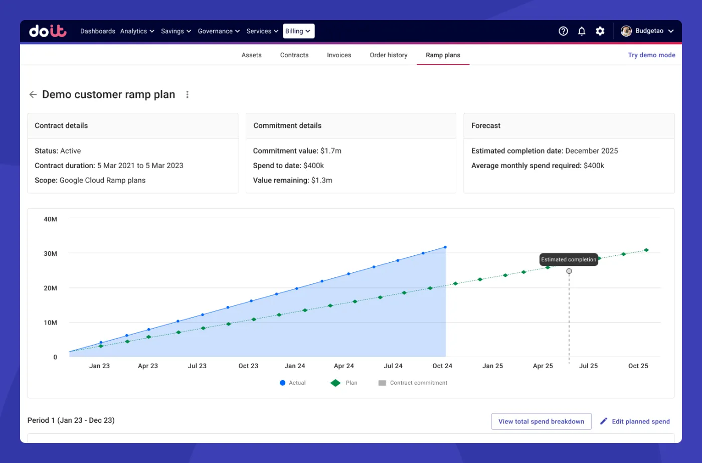
The updated detail view for ramp plans
One new feature we added was a total spend breakdown dialog. This lets the user drill further down to understand their spend in a compact dialog, without them having to break flow and use other areas of the DoiT Console. This particular feature was requested by an account manager who deals with customers on a daily basis. They explained that this would provide great detail and insight for the customer.
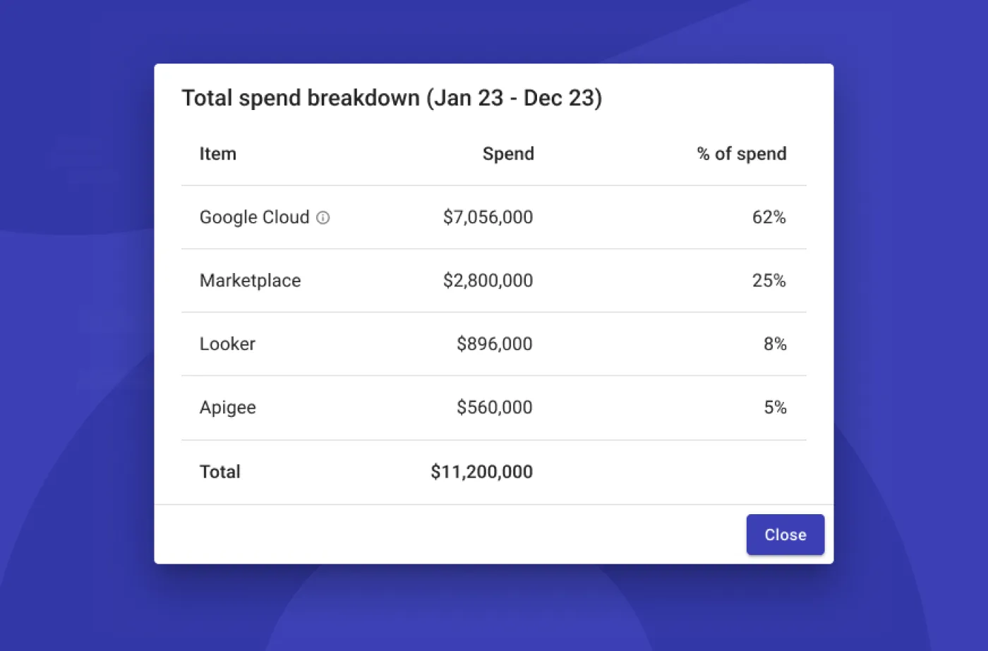
The total spend breakdown dialog
As we always do, since the release, we’ve been actively monitoring user behaviors and patterns to identify any possible issues or improvements.