Recently, we launched Cloud Diagrams, to visualize cloud infrastructure in real-time so companies running on AWS can keep up-to-date architecture documentation, troubleshoot issues more effectively and have better-informed architecture conversations.
Today, we're making Cloud Diagrams even more powerful by adding cost visibility directly into your diagrams. With resource costs available directly in your diagrams, you’ll see expensive resources in the context of their dependencies and make informed decisions about what to optimize without breaking critical connections.
Let's explore how this new update helps you and your team understand the costs they’re responsible for, with full architectural context.
Want to see how cost data looks directly in your infrastructure diagrams?
Take a self-guided tour of the Cloud Diagrams cost visibility and heatmap update.
See what each component in your architecture costs
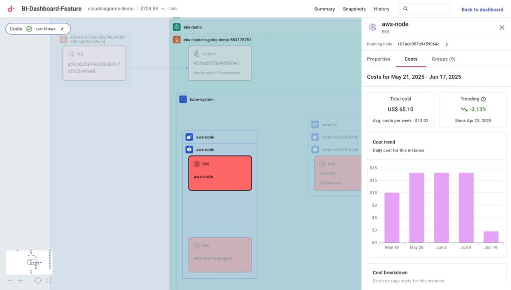
When you select a component in a diagram, you’ll see a new Costs tab alongside the component’s properties and any associated groupings (security groups, regions, VPCs, subnets). This allows you to see not just how your infrastructure is built, but how much each component costs.
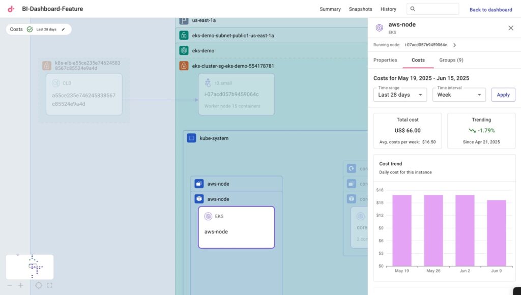
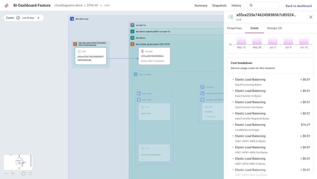
You can also see a more detailed breakdown of the SKUs driving that component’s costs.
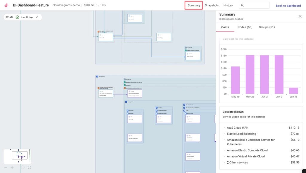
If you want to look at a similar breakdown — but instead for the whole AWS account being diagrammed — you’ll also find a Costs tab when clicking on Summary at the top of the page. The only difference is that the Cost Breakdown section will show your costliest AWS services in the account.
Find your cost hotspots
While individual component costs are helpful, you might also want to see which components are driving the most costs.
Selecting the Costs toggle on upper-left will highlight in shades of red your diagram’s most expensive components over customizable time periods.
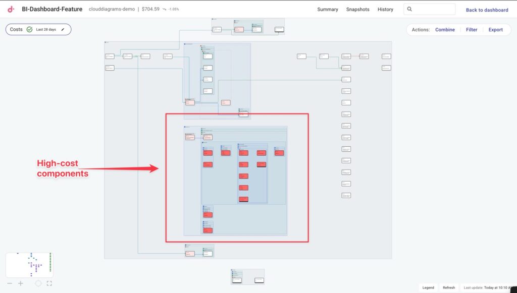
From there you can zoom in on any high-cost component and explore its detailed cost breakdown, while seeing all the components it connects to.
This gives you full context before deciding whether to optimize or modify high-cost resources.
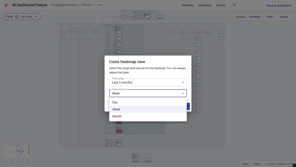
And finally, should you wish to modify the time period or intervals for your heatmap view or when you look at Costs of a component, you can click the pencil icon in the Costs toggle and adjust from there.
Conclusion
With cost data and heatmaps integrated directly into Cloud Diagrams, you can now optimize your infrastructure with full architectural context. Instead of making decisions based on cost data alone, you can see expensive resources in relation to what they connect to and understand the broader impact of potential changes.
Take the interactive tour to see Cloud Diagrams in action, or get in touch with us to learn how Cloud Diagrams can help you enable better architecture discussions and resolve incidents faster.