


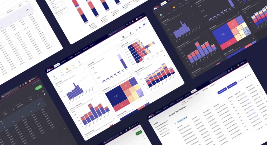
DoiT’s new branding created the ideal opportunity to improve our accessibility
The rollout of a new visual identity for DoiT provided the perfect opportunity to make our diagrams more accessible as we aligned them with the new, enhanced brand. We wanted to create a distinct, uncomplicated and approachable visual system, so it made sense to adapt our cloud management platform to reflect the new brand and enhance our accessibility.
The role of accessibility
Accessibility in design refers to making a product more inclusive so that everyone can use it. Although accessibility focuses on helping people with disabilities, it benefits all users. A real-world example of accessibility is a ramp in front of a building. It allows people in wheelchairs to access the building, but it also allows easier access for a stroller or somebody carrying a bike into the building.
In the digital space, video captions were intended for people with hearing difficulties, but they also help people watch videos on mute if they are in a crowded, loud room, for example.
In the physical space, accessibility features are required by law.
Web accessibility
If accessibility describes how usable an environment is for the maximum possible number of people, web accessibility describes how usable a website is for the maximum possible number of people. If you are serious about web accessibility, it means you are working to ensure your online technology is available to anybody who wants to use it, regardless of their abilities or environment.
For digital products, a set of recommendations called Web Content Accessibility Guidelines (WCAG) is slowly being enforced. In 2017, the European Union started requiring the websites and mobile applications of public sector bodies to conform with WCAG 2.1 Level AA.
WCAG presents four principles of accessibility that content must fulfill to be considered accessible:
- Perceivable: Users must be able to perceive the information and user interface (UI) components – meaning information cannot be hidden to all a user’s senses.
- Operable: A user must be able to perform the interactions required to operate the UI components and navigation.
- Understandable: The content and operation of the UI must be within a user’s ability to comprehend.
- Robust: It must be possible to interpret the content reliably using a broad range of user agents, including assistive technologies.
Making your website or app accessible is not just the right thing to do, it can also have a substantial impact on your bottom line. According to the World Health Organization, approximately 15% of the world’s population currently experiences disability. That represents more than a billion people, many of whom could be potential users of web technology but may be alienated by inaccessible web applications and websites.
When we look beyond permanent disabilities to temporary or situational disabiities that may affect somebody for a limited time or in certain situations, the need for accessible web products becomes even more obvious. For example, a patient recovering from eye surgery has a temporary disability that may prompt them to use a screen reader for a few weeks. Somebody who has misplaced their eyeglasses would be considered to have a situational disability, which might also cause them to use a website differently for a while.
An accessible color palette
Colour vision deficiency affects 8% of men and 0.5% of women. Focusing on accessibility not only serves people with vision impairments but is beneficial for users with situational vision impairment – in other words, they may be accessing our service in bad lighting conditions. Poor lighting can make it harder to spot differences between colors.
Color-blind people have difficulty distinguishing some colors of the rainbow, so we used Tol’s diverging color scheme as a starting point for the new design. This scheme is constructed by scaling the color coordinates – e.g. from blue to yellow to red – and it is color-blind safe.

Tol’s Sunset diverging color scheme
We adopted Tol’s color scheme to align better with our brand, ensuring that the new palette is color-blind safe.

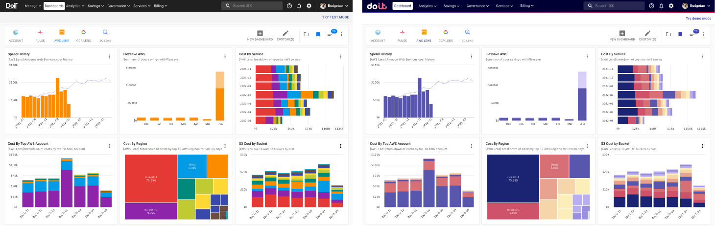
After the redesign, the color scheme is more accessible and aligned with the new brand direction.
Dark mode
Prior to the rebrand, we often overlooked dark mode in the platform and focused most of our attention on light mode. A dark theme can reduce the luminance emitted by the screen and reduce eye strain for our users. An internal survey revealed that two-thirds of Doers use the CMP in dark mode, so we used this opportunity to pay special attention to it.
For white text, a dark grey background creates less of a contrast than black, reducing eye strain. We also use desaturated, lighter colors for our diagrams and buttons for improved legibility and reduced optical vibrations.
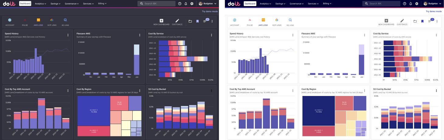
The color palette on our dark mode is lighter and less saturated for enhanced visibility
Where next?
At DoiT, we continue to make our products as accessible to as many people as possible. We see that as a way to make life easier for customers, partners, and the people that work with us.
Our next step is to make our documentation more accessible from within the platform. That includes being able to read in-context help while carrying out actions within the platform. We also want to make sure that the platform is keyboard accessible. While users with certain disabilities navigate the Internet using the keyboard rather than the mouse, power users prefer keyboard navigation for efficiency.
Making websites and other online technology accessible and compliant with WCAG may not be a legal requirement (yet), but it makes for a positive user experience and will help you attract and retain customers.